The Charge
Website Design:
About: Brooks Brothers, founded in 1818 as a family business is the oldest men's clothing company in the United States. Today, the company has a worldwide presence and a range of product offerings in menswear, womenswear, accessories, children's clothing and home furnishings.
Project Description: Develop a series of landing pages within the existing e-commerce website that captures the innovative and unique features of the Brooks Brothers primary product offerings across three classifications.
Fabric & Materials
Sourcing & Manufacturing
Design & Engineering
Objective: Optimize and engage users by telling the story of Brooks Brothers contribution to innovation in apparel. Provide strategic solutions in presenting evergreen content, design elements and e-commerce functionality that are on-brand and consistent with the look and feel of the existing website.
Collaborate with Project Managers, Copywriters, QA Teams, Designers and Front-End Developers to ensure the user experience and interactive features and assets meet all design and functionality requirements. Design, document and deliver wireframes and interactive prototypes optimized for all devices. Provide additional support outside the scope of UX and UI through image editing, image retouching and art direction.
Phase 1.
Competitive Research: I wanted to understand how both direct and indirect competitive brands within the same space were presenting similar content on their websites. I was in search of inspirational material and engaging user experiences in the form of unique layouts, creative use of imagery and interaction design elements and assets that could be applied to the Brooks Brothers website.
The information obtained was documented in a spreadsheet containing brand names and URL's along with notes pertaining to the specific elements, functionality and interaction design features that we could reference and consider for implementation on the Brooks Brothers website.
Phase 2.
Wireframes: I developed the framework for the layout and structure of the pages in the form of low-fidelity wireframes with detailed annotations. These pages were designed with responsive compatibility in mind - additionally, close attention was given to the arrangement of the assets so they are presented in a clear aesthetic format consistent with the look and feel of the existing website.


Phase 3.
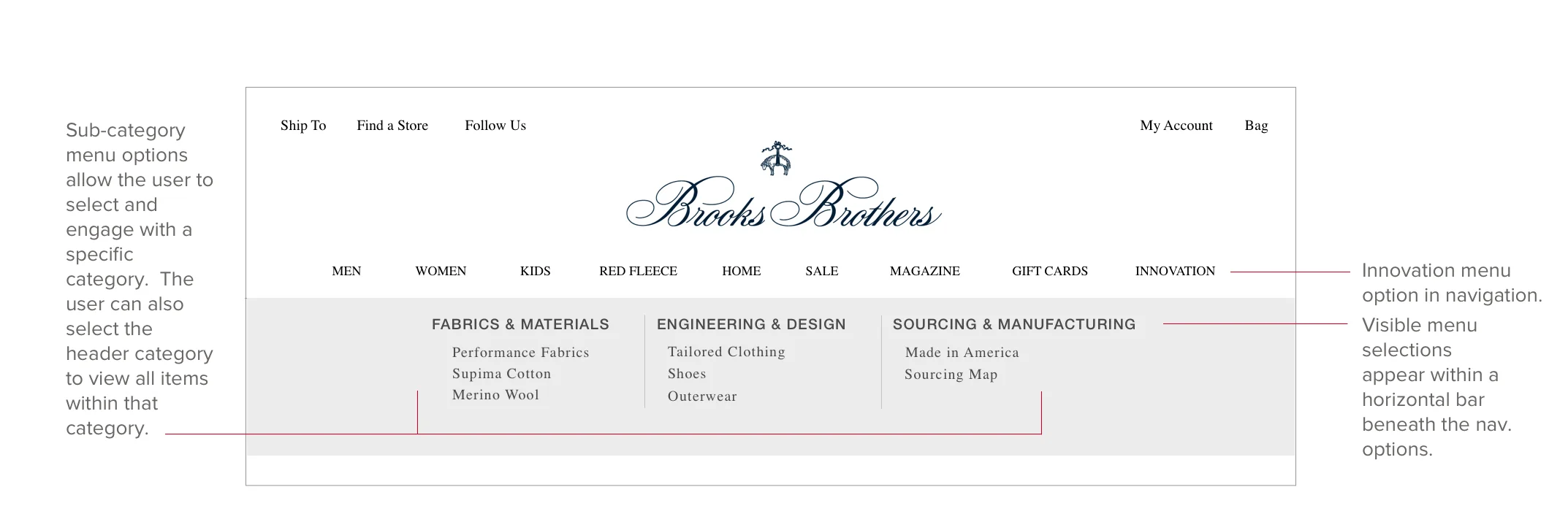
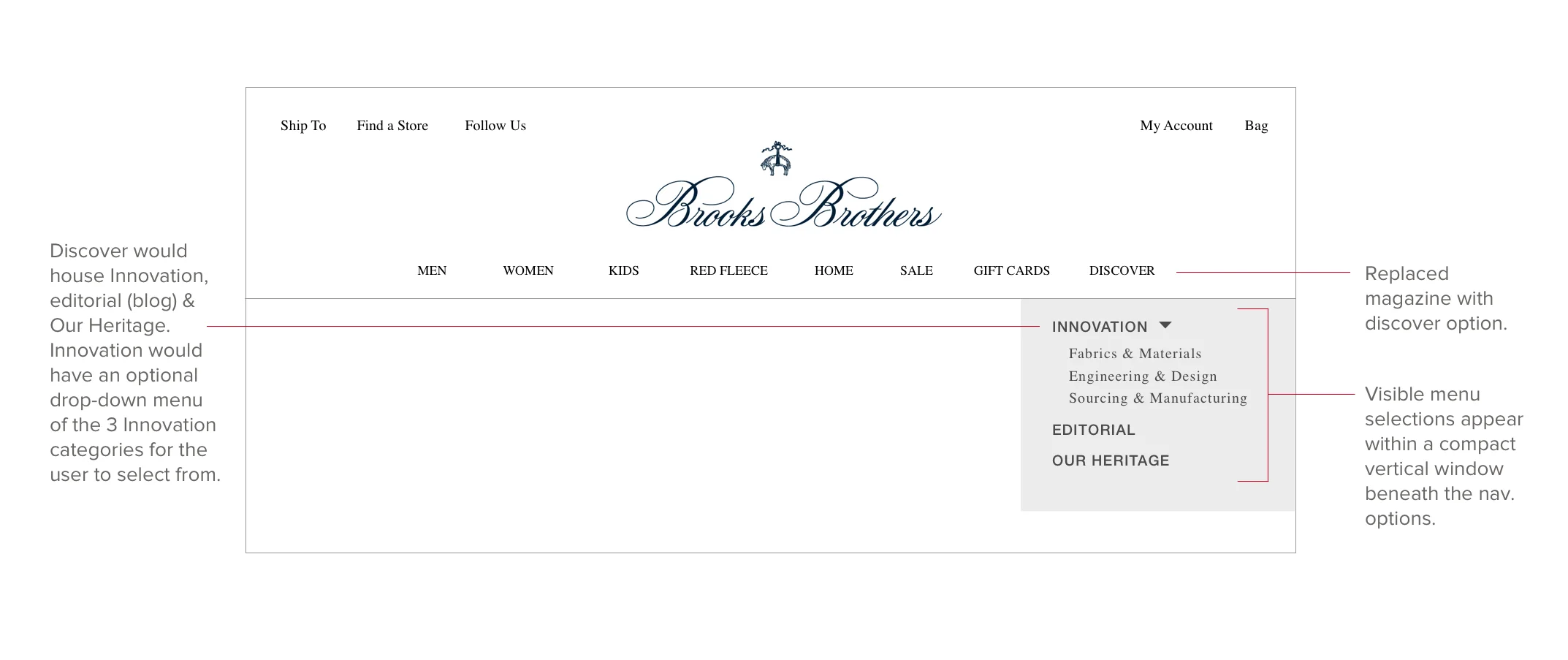
Navigation: I developed a range of navigation task flows using wireframes with annotations to explain how a user would access the innovation pages through the main navigation bar.


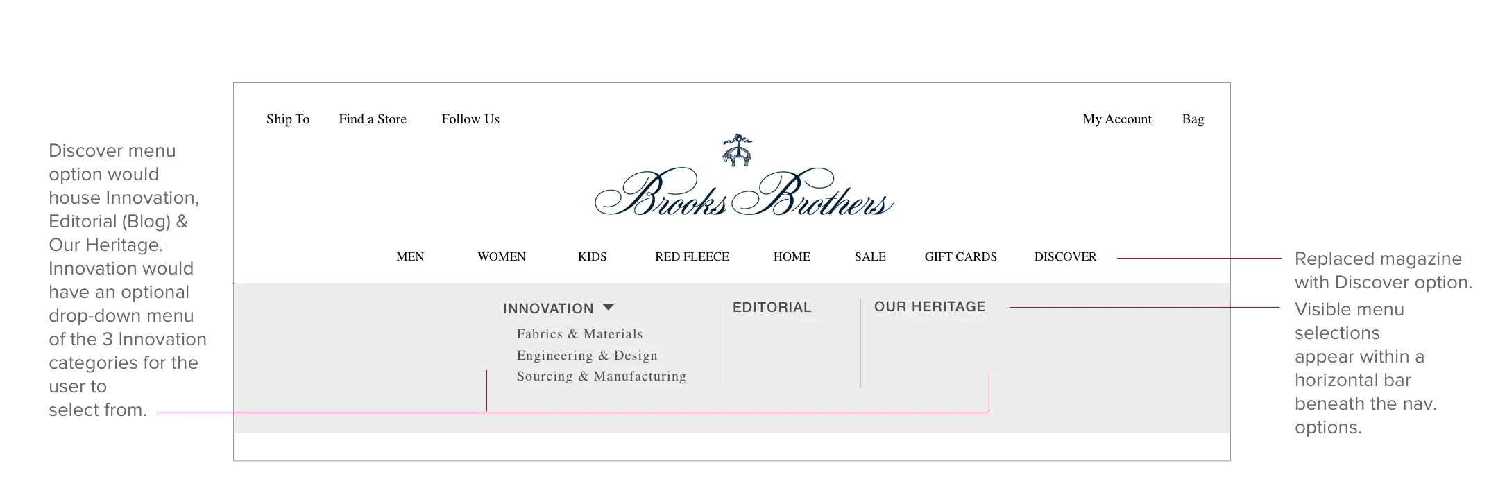
Final Selection: The below wireframe represents the navigation version selected to be used. A user selects the menu option Discover (a new category within the navigation that would house the innovation pages along with additional pre-existing pages). When Discover is activated a drop-down menu providing a selection of options is presented. If the user selects Innovation a sub-menu appears providing the three page options for the user to choose from.
Phase 4.
Page Navigation: It was important that the user have visibility and access to the other two Innovation pages without having to refer back to the main menu. The below wireframes are the proposals I presented to management for consideration.
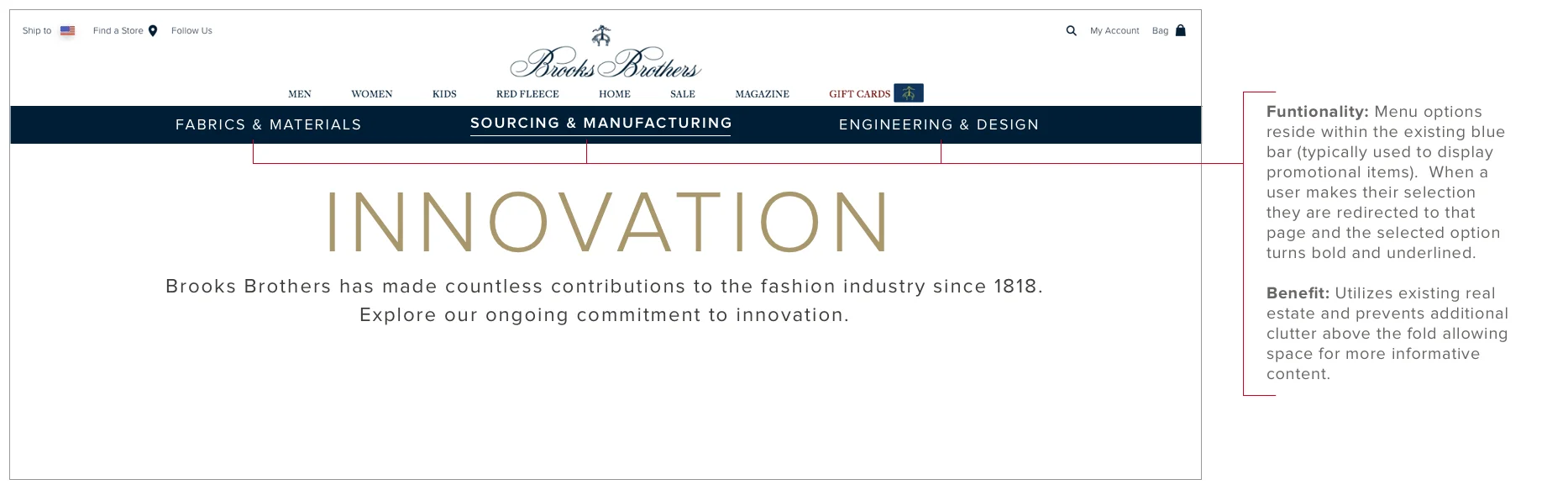

Final Selection: It was decided that the below wireframe is the most suitable format for the Innovation pages as the look and feel is on-brand with other elements of the existing website. Additionally, the button format is compatible for mobile application.
Phase 5.
Time & Action: After completion of the wireframes my Project Manager and I arranged a meeting with the Development Project Managers to discuss the timing and milestones necessary for completion of this project. We reviewed the low-fidelity wireframes to help determine how long it would take to complete and pass off high-fidelty wireframes, implement those designs and perform QA testing prior to launch. The low-fidelity wireframes was a perfect working tool for this meeting because it provided a clear picture of the framework and assets in addition to the expectations we have of the development team from a execution and timing point of view.
Phase 6.
Information Architecture: I developed a flat taxonomy site map that outlines new and/or updated menu options and their interactions with existing pages. Furthermore, it demonstrates how the new Innovation pages enable CTA functionality that when activated, redirects users to existing commerce pages.
Phase 7.
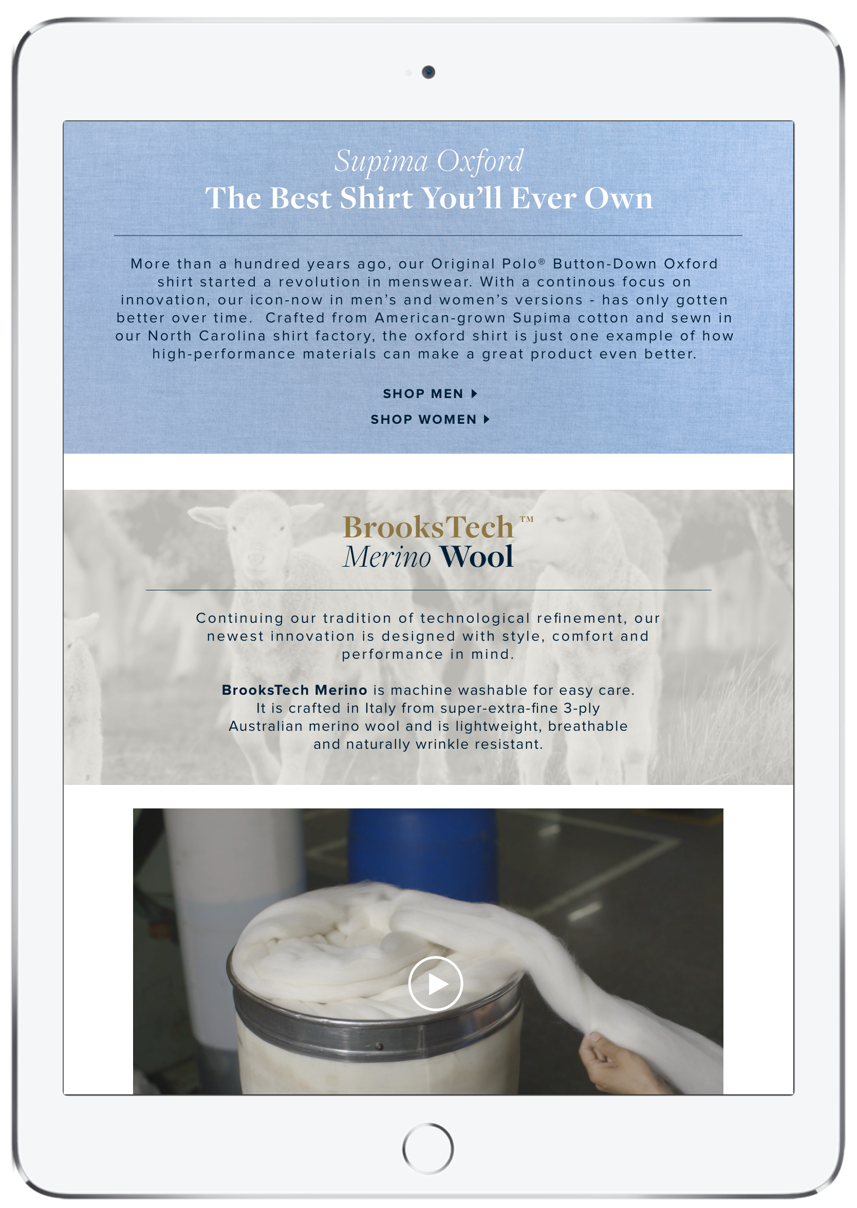
Responsive Compatibility: The below mock-ups of the Fabrics & Materials page show the visual design assets and their responsive compatibility across multiple devices - click to enlarge.


Phase 8.
UI / User Interaction: Throughout the duration of this project I was tasked with introducing interactive features throughout each of the Innovation pages. The final design includes interactions that allow a user to click and / or hover over specific assets that activate overlays, change color and resize images. Here are some examples.
Map / Desktop: The Sourcing & Manufacturing page includes an interactive map where users can click on a location pin that activates a tooltip with information about the factory within that geographical location.


Map / Mobile: The mobile version of this interactive feature had to be modified to accommodate smartphones because the location pins would be too small for user interaction. The modified version includes a button titled "Choose A Country" that when clicked activates a drop down menu with a list of the different countries they can choose from. When a user makes their selection an overlay screen appears containing the information about the factory within that geographical location.


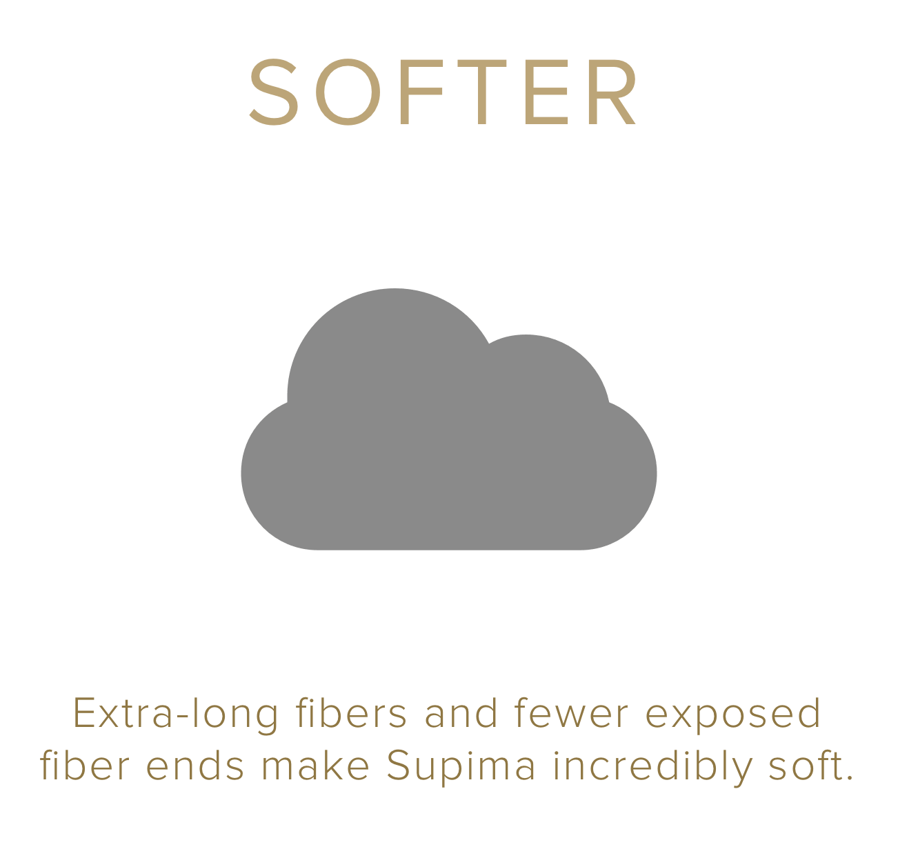
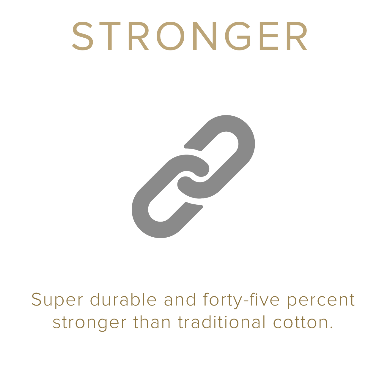
Icons / Desktop: Here are a few examples of assets where I applied hover effects. As the user mouse-overs the icons the hover states provide different results.
Softer - slightly enlarges and changes color
Stronger - separates and changes color
Brighter - changes color

Phase 9.
Interactive Design Guide: These redline documents are high-fidelity wireframes with detailed annotations that equip the development team and project managers with critical information as it relates to the visual elements, IxD, UI features and overall functionality of the Innovation pages.
Action: Describes the physical interaction taken by the user (ie. Click, Hover, Scroll etc…)
Reaction: Describes the outcome and / or result of that specific action (ie. fades in, color change etc...)
Reference: Provides a visual reference (ie. URL, Interactive Prototype etc…) for additional support and improved clarity on the action & reaction of that specific functionality.
Hex #: The color hex code describes the RGB composition of that particular color.
Image / Video Location: Provides the location of that specific image or video (ie. URL, Assigned file location, etc…)


Phase 10.
Interactive Prototypes: Here you can view the Invision interactive prototypes for desktop, smartphone and tablet. The Invision platform enables me to communicate with project managers and developers by showcasing the interactive features, breakpoints, and the overall look and feel of the Innovation pages. Please keep in mind there is limited functionality as these are only prototypes.
Desktop Interactive Prototype: Please view on a desktop computer.
General functionalities include:
Hover effects
Click to open
Click with overlay
Smartphone Interactive Prototype: Please view on a smartphone.
General Functionalities include:
Continuous scrolling
Click to open
Tablet Interactive Prototype: Please view on a tablet.
General Functionalities include:
Continuous scrolling
Click to open