Project 5

Bonobos
Mobile Redesign:
About: Bonobos is an e-commerce-driven apparel company that designs and sells men's clothing. The existing responsive web design (RWD) is a clean and sophisticated UI that provides simple navigation for its users. Additionally the layout, style and user experience is well preserved in the mobile version.
Objective: Although the existing Bonobos website is both visually pleasing and intuitive I wanted to explore and develop a new design option that would address specific UX and UI elements that I felt were missing or should be deemphasized. The updates proposed are intended to reduce bounce rates, increase conversion and ultimately improve profitability. In addition it was essential that I retain the vision and integrity of the Bonobos brand throughout this exercise.
Competitive Research: To kickoff this project I researched websites of direct and indirect competitors. I wanted to understand those features I see working for them and / or against them. Meanwhile, I was also looking for inspiration and newness that I could translate into my design. Below is a list of some of the companies I researched:
- Jack Threads
- Theory
- Anthropologie
- A.P.C.
- Helmut Lang
- Diesel
- All Saints
- Rag & Bone
Wireframes: Initially I created rough hand drawings of my proposed layouts. Soon thereafter I translated those ideas into low fidelity wireframes using the program Sketch to establish overall layout and design elements such as icon, image & text placement together with call to action buttons. My primary focus of the redesign was on three areas of the Bonobos website that I consider to be the core aspects of the on-line shopping experience:
- Home Page
- Content Page
- Product Page


High Fidelity Design: After completing the visual audit of the existing Bonobos website, collecting inspirational material from competitor websites and developing my wireframes via Sketch I was able to move forward into the high fidelity design phase.
Home Page
Existing Home Page screen shots:


Header: In keeping 'on brand' I used the current Bonobos black logo on white ground. I also introduced a search option icon next to the hamburger menu to enable users to conduct quick item searches.
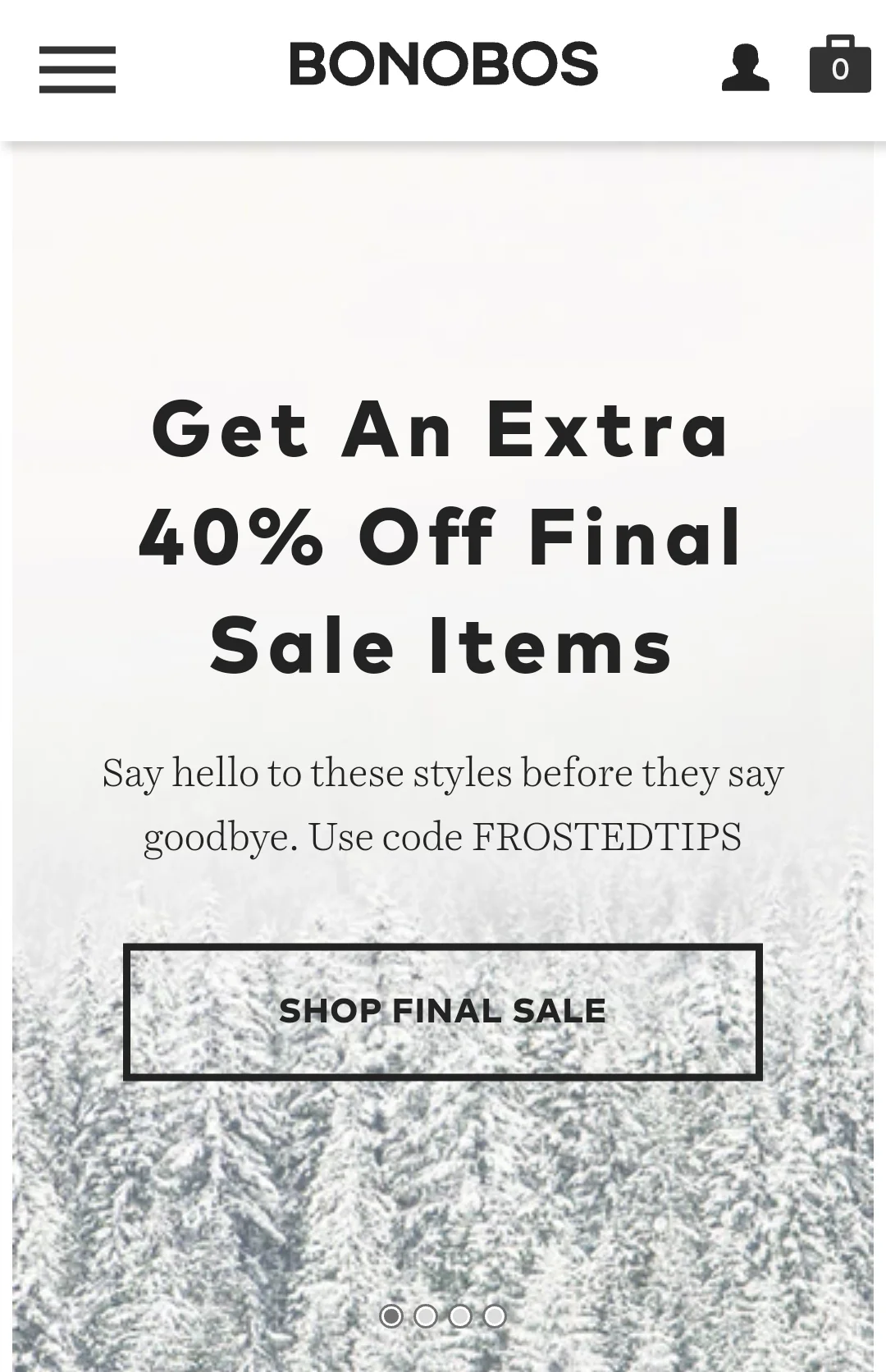
Sale Banner: The sale banner on the current website is oversized and consumes the entire view up until the fold. The banner appears to place more emphasis on sale items rather than full priced items. For this reason I significantly reduced the size of the banner and introduced a "New Arrivals" button. This button is accessible before the fold and will take the user directly to the latest full priced items.
Find Your Fit: For this view I kept the original text about the guideshops but I selected a different Bonobos image using text overlay which speaks more to "fit" instead of the current sketch / image of a guideshop. For added effect and familiarity I added a location pin icon to the "Find a Guideshop Near You" button.
SS17 Resort Collection: In the existing website, the next view is an image along with text about how Bonobos got started. I decided to turn this feature into a small link at the footer of the page as I believe this space should be occupied by a feature that sells product rather than telling a story about the company. I took an existing Bonobos image - cropped it and added text overlay that brings the user to a page where they can shop the SS17 Resort Collection. There is also an arrow icon on the image that allows the user to swipe through a series of pages that promote additional products offerings.
Footer: The only adjustments I made here was adding a link called "Our Story" to the menu options - this is the new name for "How We Got Started". I also changed the color of the bottom half of the footer as I felt the all black color on the existing website was too heavy.
Content Page
Existing Content Page Screen Shots:


Menu Options: For the redesign I decided to remove the hero image and reduce the number of CTA buttons by placing focus on just three primary functions.
- FILTERS - Provides the user with options such as fit and wash type.
- NEW - Lists only those denim products that are considered new inventory.
- SALE - Lists only those denim products that have been marked down.
Product Indicator: I added a product indicator within the header to let users know how many total items correspond to their search. As the user scrolls down the page the indicator shows how many items are visible before the fold.
Content Layout: The existing content layout consists of individual product pieces showing a range of washes or colors, a product name and price. I felt that the main image should show a person wearing the garment along side a product description. In addition I included the number of fits and colors that correspond within that particular product category.
Product Page
Existing Website Product Page Screenshots:


Product Selections: This page provides a full-bleed image and description of the product category along with the fit name and price. I kept the multiple image scroll option with only minor styling and placement adjustments - I also kept the product zoom capabilities. As you move further down the page, there is a brief product description followed by a series of drop-down menus allowing the user to define their selection(s).
- WASH - Provides drop down menu of the various denim wash options for that particular category.
- FIT - Lists all available fit options with descriptions.
- WAIST - Shows all available waist measurement options.
- LENGTH - Shows all available length measurement options.
Add to Bag: The size of this call to action bar was slightly reduced and the color used (Hex #C69B9C) was taken from an existing Bonobos image.
Icons: There were some slight adjustments to the existing icons
- FIT GUIDE - The icon was removed and added to the product description drop down menu.
- SPEAK TO A NINJA - The Ninja is the name given to the Bonobos customer service agent (as explained on the home page). The existing website uses a question mark and the word help. I updated the icon to a Ninja face and updated the wording accordingly. In addition, I updated the placement by adding it to the product description menu and differentiating it by using a darker color.
- TRY IT ON - I kept the verbiage and icon but updated the placement by adding it to the product description menu and differentiating it by using a darker color.
Product Description: The existing website has visible write-ups of the following categories. In order to minimize space I introduced drop downs so the user can choose which item(s) they want to review.
- ABOUT - General overview of the garment including content, fit name, fit description, wash information, stretch or non-stretch and country of origin.
- WASH - Detailed description that explains the wash treatment process.
- CARE - Provides the assigned care instructions for the garment and wash selected.
- FIT GUIDE - Explanation of the various fits they offer within that specific product category.