PSFK: Website Redesign

Description
PSFK is a trend and innovation business intelligence service for the retail, advertising and product design industries. They provide tools and guidance through subscription memberships with access to reports, newsletters and trends that helps creative professionals leverage innovation for their products, services and customer experiences.
Objective
Improve the usability of the existing website by conducting research and developing a sound UX strategy that satisfies the PSFK business objectives and the needs of their users. Provide a range of deliverables that effectively communicate user interaction and design concepts with the overseas development team, internal team members and PSFK stakeholders.
What I did
• Research
• Usability Testing
• Wireframes
• User Flows
• Visual Design
• Content Strategy
• User Interface Design
Phase 1
Research
Within the initial stages of this redesign project I conducted a usability test in the form of a short email questionnaire to capture feedback on the current state of the PSFK website. The majority of the feedback I received appeared to be consistent with my own evaluations.
Difficulty navigating
Search functionality is confusing.
Unclear value proposition
What do they offer? How can I benefit from them?
Inconsistency across pages
Page layouts and look & feel are not cohesive.
To better understand the inner-workings of PSFK I met with key members of their team to learn detailed information about the product offerings, services and future initiatives. Membership feedback on website usability was made readily available through previous in-house interviews. Google Analytic data provided additional insight into user behavior patterns highlighting under-performing pages, purchasing analysis and content view analysis.
The last step within my initial research phase was to collate and synthesize all the information gathered that included my external research and assessments, PSFK feedback and quantitative data.
Phase 2
Value Proposition
One of the first areas of the existing PSFK website that required immediate attention was the information presented in the hero section of the site located above the fold. A combination of graphics and text consumed too much space and was unable to effectively deliver a clear message about their unique benefits and resources.
Value Proposition - Proposal
PSFK had an opportunity to optimize the hero section of their homepage in a way that would promote value and entice further site exploration. I decided to use a carousel banner that featured three scannable messages with corresponding links to detailed pages of content highlighting their attributes, services and resources.
Phase 3
Payment Process User Flow
After reviewing the user flow for the payment process I immediately noticed room for improvement. Specific information within the process should be re-prioritized. After a user chooses a subscription plan, the number of steps involved could be reduced therefore minimizing bounce rates.
Payment Process User Flow - Proposal
Reevaluating the order and consolidating the steps within the payment process is intended to reduce the time and complexity a user spends clicking through various screens during the transfer of payment information. The below user flow outlines my intentions.
Payment Grid Structure
The PSFK payment grid instituted in early 2016 was due for a makeover. The feedback from existing members and new users alike found the grid style layout difficult to understand.
Current Version
Payment Grid - Proposal
After researching the payment grids on various websites, I found there to be a consistent similarity. The majority of payment grids were in list formats with pricing structures always starting from the lowest price to the highest price reading left to right. The new version I proposed now provides a clear breakdown of the PSFK services provided beneath their corresponding subscription prices making the information legible with a clear call to action for each subscription package.
Payment Grid, Mobile - Proposal
The format of the payment grid would stack into easily digestible cards on mobile.


Phase 4
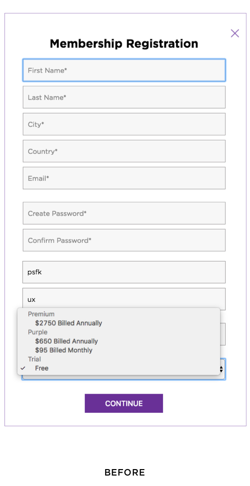
Membership Registration
The development team built in a drop-down menu that enabled users to select a subscription package directly through the Membership Registration screen. This addition presented itself as a "feature-creep" that was initially accepted by management but had very apparent issues that needed to be addressed.
My primary concern was the lack of information made available for the user to make an informed decision on membership packages. My challenge was to figure out a way to display the subscription information within a relatively small space that is both easy to read and functional on all devices. After conducting some research I decided to convert the drop-down function into a slide-rule format that provides clear visibility and accessibility to the different packages.
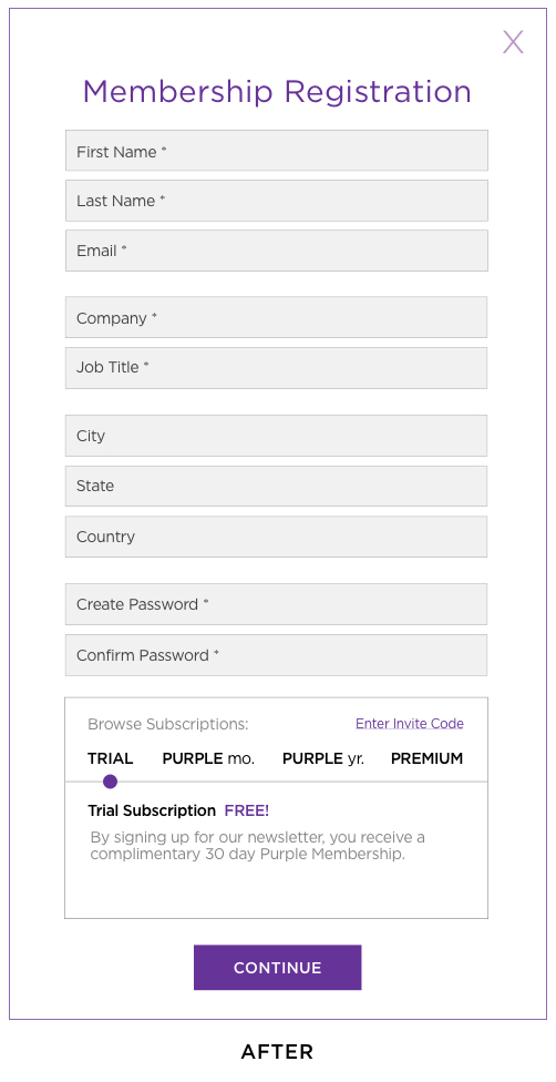
Membership Registration - Proposal
The default package tells the user they have been given a free trial subscription by signing up for the newsletter. At this point the user can click continue or they can review the other options with the help of the slide-rule indicator to obtain the following information:
Subscription Term (ie. monthly / annual)
Subscription Price
Subscription Details & Offerings
Once a user selects a subscription package and clicks continue they are taken directly to the Review and Checkout screen.

Phase 5
Review & Checkout Screen - Proposal
This screen contains all the required information needed for a user to complete a subscription purchase. As previously mentioned in the Payment Process User Flow, this operation was originally a two step process that has now been consolidated to one page.
Your Order
Provides a clear recap of the subscription details pertaining to that specific package.
Billing Information
Provides the fields necessary for a credit card purchase, there is also the option to Create and Invoice.
Order Summary
Provides a complete overview of your Subscription, Added Users and Group Codes with a Grand Total price. There is also the option for the user to activate Auto Renewal.
Phase 6
My Account Pages - Proposal
Members would have access to these administrative pages where they’re able to manage members and teams, update account information, view payment history and upgrade their membership benefits.
Team Management
Members can add additional users, view their dashboard
and manage their users / teams
Payment Management
Review all transactions and update credit card information
Account Information
Used to update personal information such as email address, password and occupation
Current Membership
Users can use this screen to upgrade their membership
Phase 7
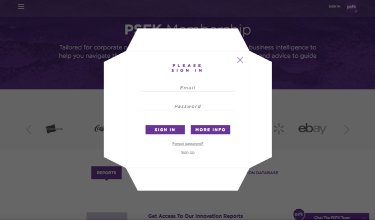
Sign In Modal
The membership sign-in is outdated and sits on top of a grey background. I redesigned the modal so that it looks more inline with the overall look and feel of the site using calls-to-action that are easier to read and encased text fields.
Before
After

Newsletter Sign Up
For users that want to sign up for the PSFK Newsletter they are faced with a Member Registration that appears as an overlay containing a list of required fields. I developed an updated Newsletter modal that appears on the screen if a user is either not logged in or interacting with the site for a specific amount of time. The modal contains one clear statement and call-to-action that they can easily dismiss by clicking outside the modal or using the X icon.
Before

After

Phase 8
Homepage
The homepage content and service offerings were being displayed together with no clear hierarchy or page organization that would help users differentiate content. The company service offerings can be easily overlooked as users are browsing through editorial content. The headlines are positioned over images making some of the names illegible especially on light-colored backgrounds.
Homepage - previous layout
Homepage Proposal
The new content layout uses the banner carousel and organizes the service offerings along the left side of the page (only in the web version). When the service offerings are clicked by the user they are redirected to pages where they can purchase PSFK Reports, Newsletters and any other services PSFK wants to promote.
Editorial content accompanied by eye catching imagery and color is prioritized at the top of page to attract new users. Within the content page there are additional banners that promote services, events and membership to users as they scroll down the page. Lastly, the editorial subjects are now encased in a box partially covering each image using the signature PSFK purple to help improve visibility.
